Just over 6 months ago, I put myself forward for a lightning talk at CILIP Conference 2022 as part of the New Voices, Big Ideas section of the programme. I’ve had a variety of experiences in my career, throughout being a copywriter and then working in marketing and digital, and now libraries. I’ve presented to colleagues, potential or existing clients, lecturers and fellow students, but never to an audience of my peers, at a conference no less! Unfortunately, covid knocked on my door, and I wasn’t able to attend the conference in person. Instead, I recorded my presentation to be shown as a video and I followed along with the conference chatter over on Twitter. I always intended on sharing what I discussed in my talk, on this blog, so here we go.
Usability, Accessibility and Sustainability
The CILIP Conference 2022 theme was sustainability, and I approached this in two ways. When we think of sustainability we often think of things that are eco or environmentally friendly. But the word sustainability means something that is ‘able to be maintained at a certain rate or level’, which is at the core of many problems – eco or otherwise.
When given the task of improving The Manchester College library website, the questions at the heart of my thinking were – how do we make a library website easy to maintain? How do we ensure that the groundwork, or the foundation, is laid for years to come? How do we guarantee that all we will need to change going forward is the what (content) rather than the how (information architecture)?
Information that isn’t organised systematically can be impossible for students or patrons to navigate, which can not only directly affect their user experience, it can also increase the amount of energy used to find the information. A lot of information that hasn’t been organised or categorised properly is also difficult for library staff to maintain – consider a physical library collection for instance, and apply that to a digital space. How your library website is organised and structured is fundamental to its usability, accessibility and sustainability in the practical sense. There are also environmental benefits to improving the usability and accessibility of your website, so a website can be sustainable in every sense of the word.
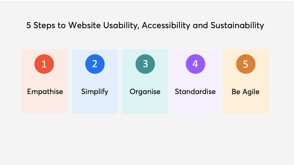
5 Steps to Library Website Usability, Accessibility and Sustainability
In my talk for CILIP Conference, I broke the process I developed into 5 steps: Empathise, Simplify, Organise, Standardise and Be Agile.
Empathise
When it comes to the usability and accessibility of any website, it’s important to understand your user – why are they using your website? What are they looking for? Do they have any accessibility needs?
For a lot of library websites too, we have to understand our team members – how much time do they have to work on website updates? What are their capabilities / skills?
Simplify
Reducing or merging duplicate content helps to simplify your website in a number of ways. It can help with the user experience as it may reduce the time it takes to find the information they need, which in turn may improve their perception of the website, company/library and their own ability to find information. The latter point is incredibly important for libraries, especially academic libraries, as library staff, teaching staff and students deal with so much information. Finding information has varying levels of difficulty and it is important for people to have advanced search skills in an academic setting, but this doesn’t mean that the experience needs to be difficult. Where possible we should recognise pain points in finding information and smooth those out. Reducing the amount of information in the first place is one step we can take to achieve this.
For The Manchester College’s website, we started with 180 guides, which amounts to around 1000 pages in total. We reduced and merged these to a point where we had a total of 106 guides (500 pages). I discussed how I did this in more detail over on my post on Improving the Usability of a Library Website: Information Architecture and Sitemaps.

Once you have simplified what you already have, going forward it is worth asking yourself ‘do I really need to add this new piece of content’ before you actually do it. Most of the time, older content just needs updating or replacing, and it’s much simpler for the user if you do this than if you create more pages for them to navigate.
Organise
If you have reduced your content, the next step to make your website more usable, accessible and sustainable is to assess the organisational structure of everything on your website. I described the process of assessing the information architecture of your website and developing a hierarchical structure in detail in my post on Improving the Usability of a Library Website: Information Architecture and Sitemaps. However, some key points here are:
– Once you begin to organise, you may keep going back and forth between simplifying and organising, and that’s ok, it’s an iterative process.
– Your users are key to understanding how the information on your website should be categorised: include them in the process, do usability testing and card sorting, and recognise that this may also change over time.
– If something doesn’t fit, ask yourself why. Do you need it? Is it achieving what you want it to achieve?
Standardise
Standardising the design of your website should be reasonably easy if you have branding guidelines; colours and fonts should be a given. But also how information is laid out on a page, both visually and cognitively, is incredibly important in creating familiarity for users. A design that a user feels they have seen or used before makes the website much more likely to be easy to use and understand.
Considering pain points for a moment, and why they are such a negative element in design – we create products for people to be able to use, or to look at. Physical products that are made to be used, which are subsequently difficult to use, cause frustration and sometimes may even stop being used. The same can be said for websites. If a user (student) visits a (library) website and can’t find what they need easily, they will look elsewhere (Google). Students’ relationship with information can be improved not only by attending InfoSkills workshops, but also in the quality of their digital experience when looking for information in the first place.
Be Agile
The most important element of any process or project is to be agile. This word is thrown around quite a lot in the digital sphere so in essence:
– Do regular usability testing – don’t assume you have all the answers, things change, the world changes and people change.
– Continuously improve when and if needed. Don’t be afraid to start from scratch on something you worked hard on that just doesn’t turn out quite right.
– Consider a minimal viable product – you don’t need to go from 0-100 real quick. The best changes happen gradually over time.
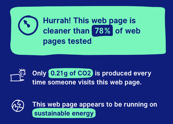
External analysis like Website Carbon, colour contrast checkers, or other websites can be really helpful, but nothing beats understanding your user. So get to know them better.

Leave a comment